Workday
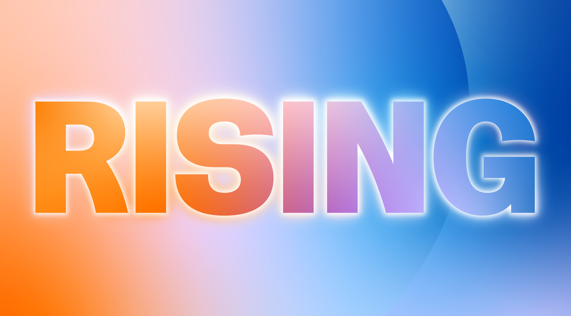
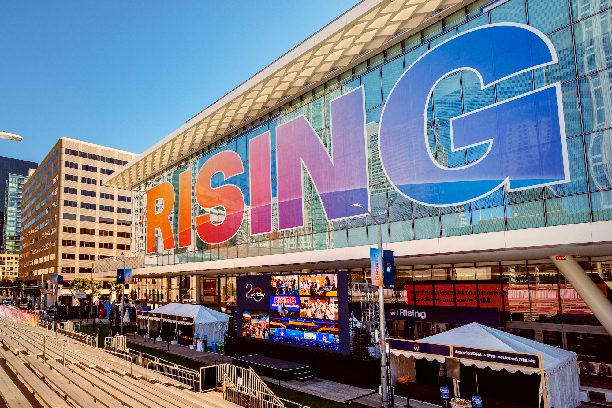
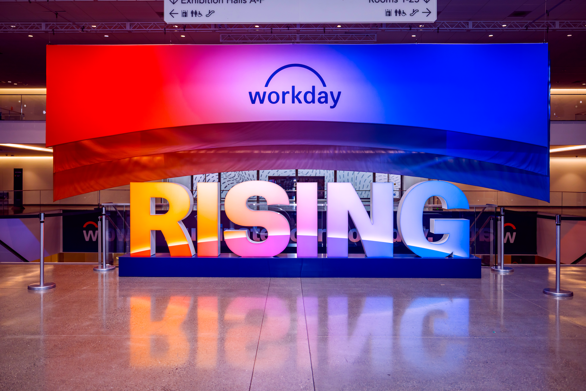
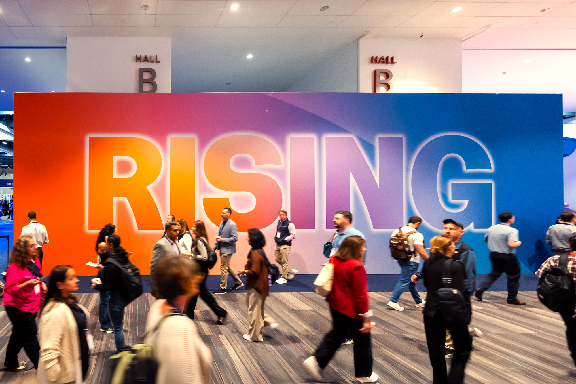
Rising 2025
Workday Rising is our largest, loudest, and most impactful moment of the year. Designed to bridge the gap between business strategy and user experience, this flagship event offers deep dives into our technology roadmap for thousands of attendees. It is the ultimate driver for business velocity, creating a direct line from attendee engagement to pipeline acceleration and expanded product adoption.
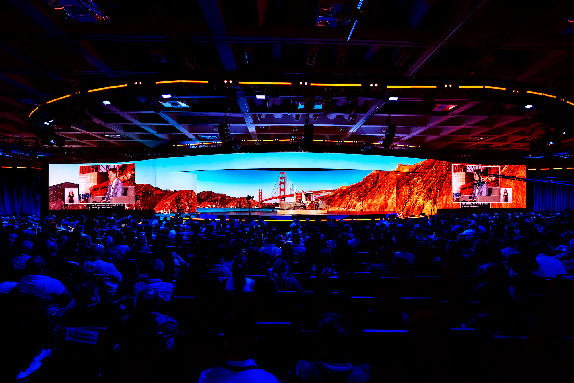
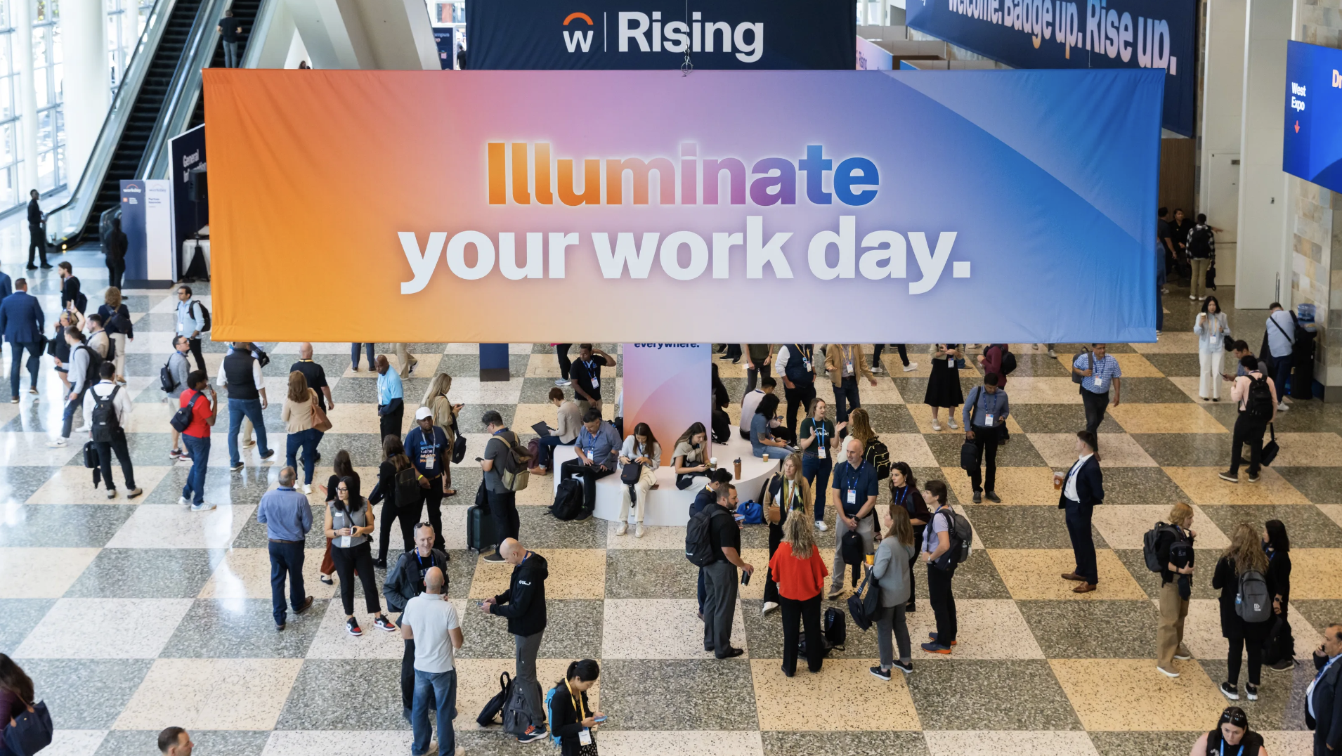
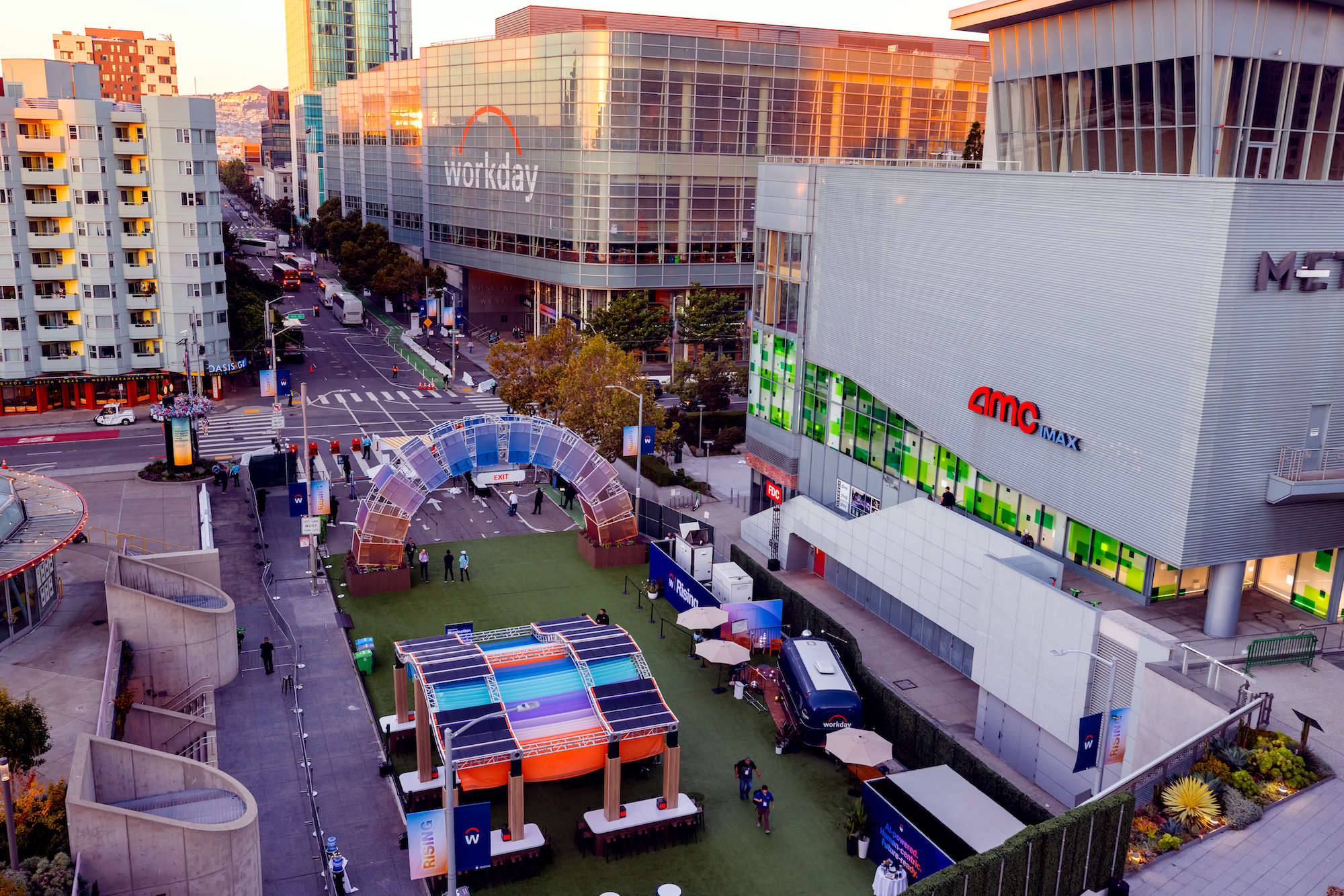
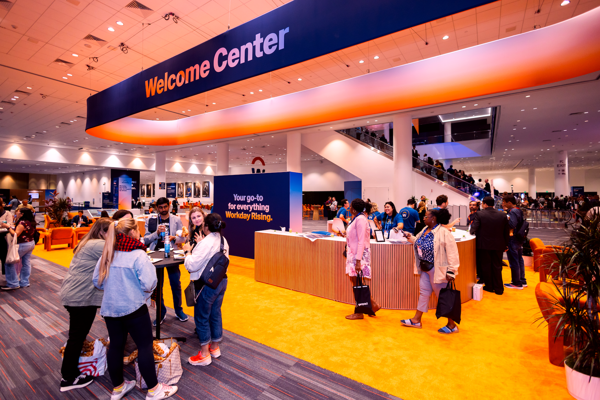
Workday Rising 2025 was our largest event yet, with nearly 20,000 attendees. Hosted at the Moscone Center in San Francisco, we closed down Howard Street, creating a true campus experience. The 2025 event marked two major milestones: Workday’s 20th Anniversary and the debut of the new brand identity on a global stage.
The Look and Feel
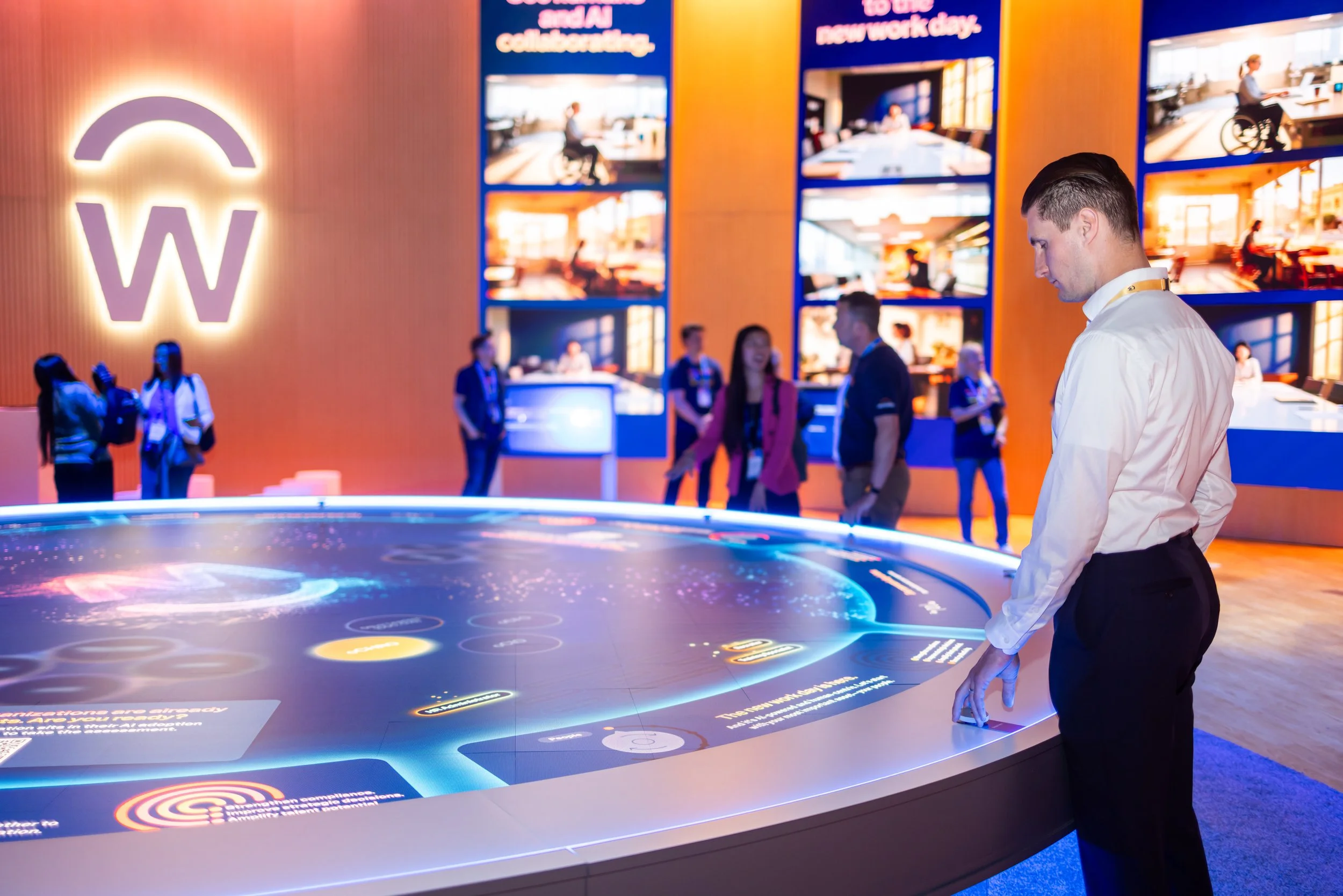
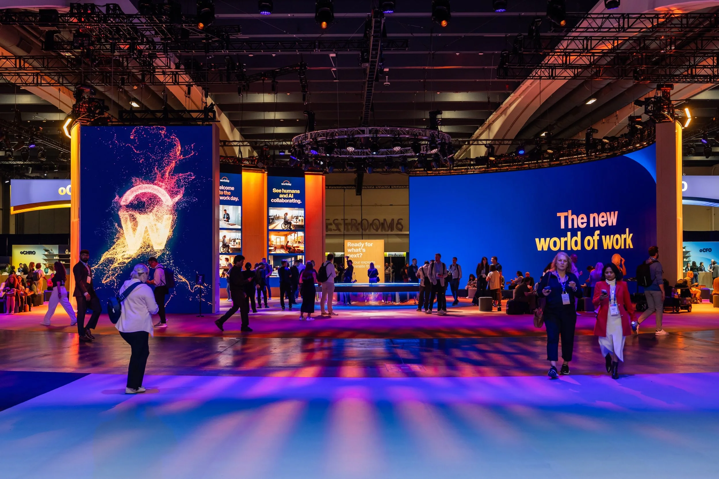
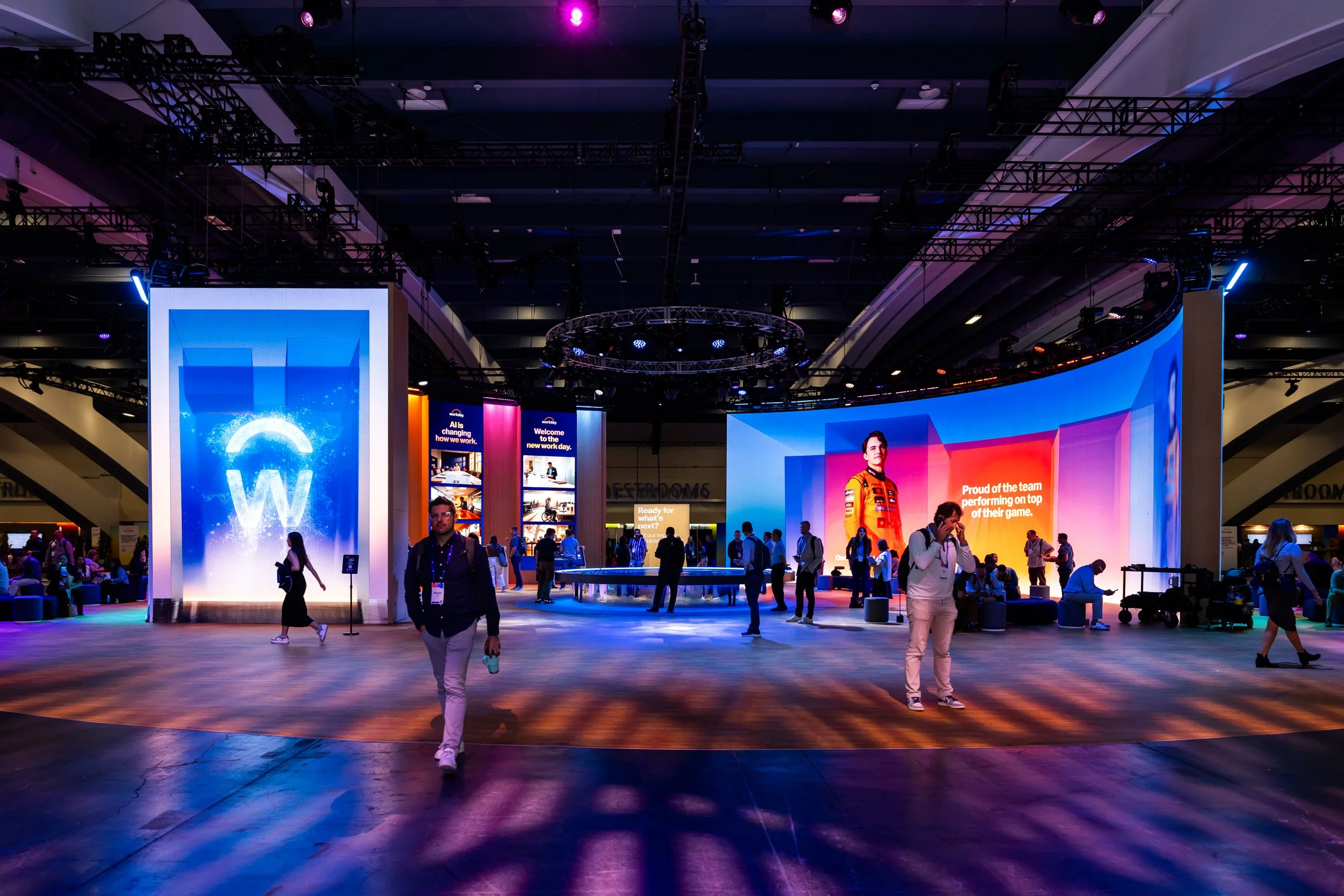
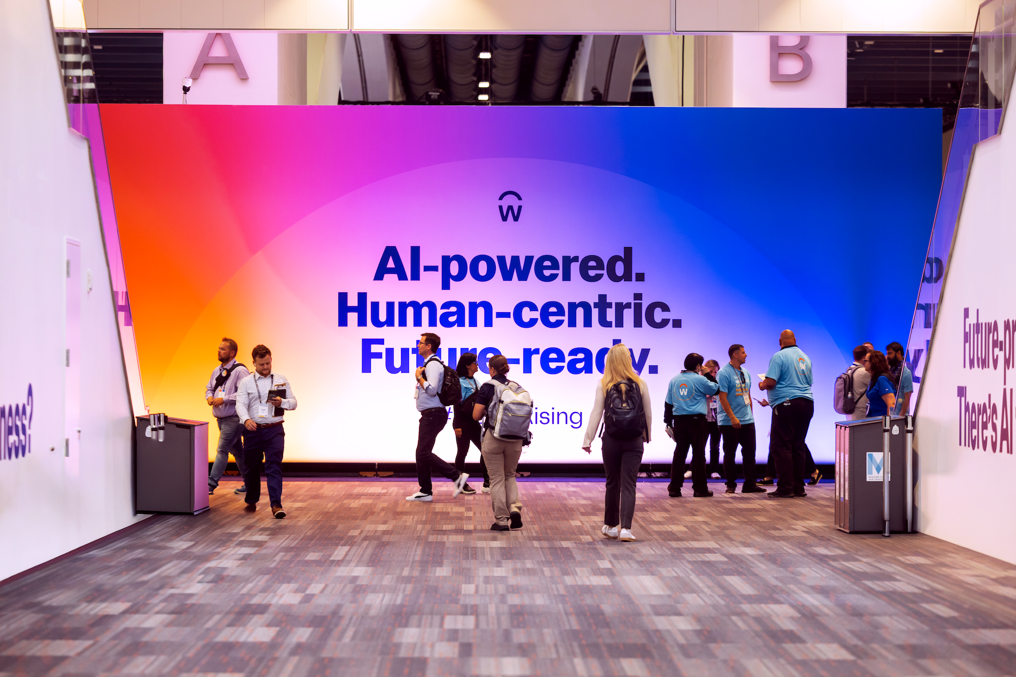
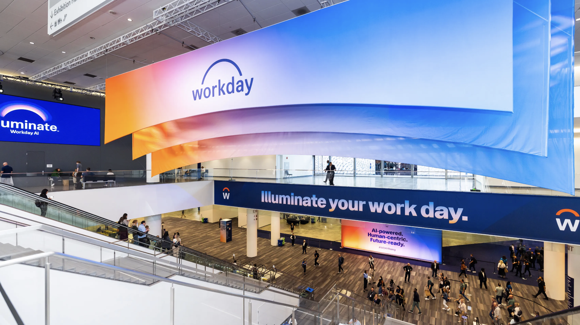
The visual identity was anchored in the concept of a rising sun, a literal and metaphorical nod to the brand's name and its future. We used light bends, fun promotional treatments, and freeform gradients- inspired by the new Workday brand, to define the space. This strong foundation allowed us to flex the brand in strategic moments. from the latest technology, to translucent materials, to 60’ illustrated murals. and “Instagrammable” moments.
Mara has built amazing relationships with both stakeholders and vendors. She's always able to quickly find a creative solution to any problem we face. But what stands out most to me, is her dedication and reliability. She is so on top of every detail, ensuring nothing slips through the cracks, and consistently goes above and beyond—often working outside of standard hours to meet deadlines or move projects along. Her ability to manage hundreds of simultaneous projects is truly impressive, and I'm SO lucky to have this kind of support in a coworker!
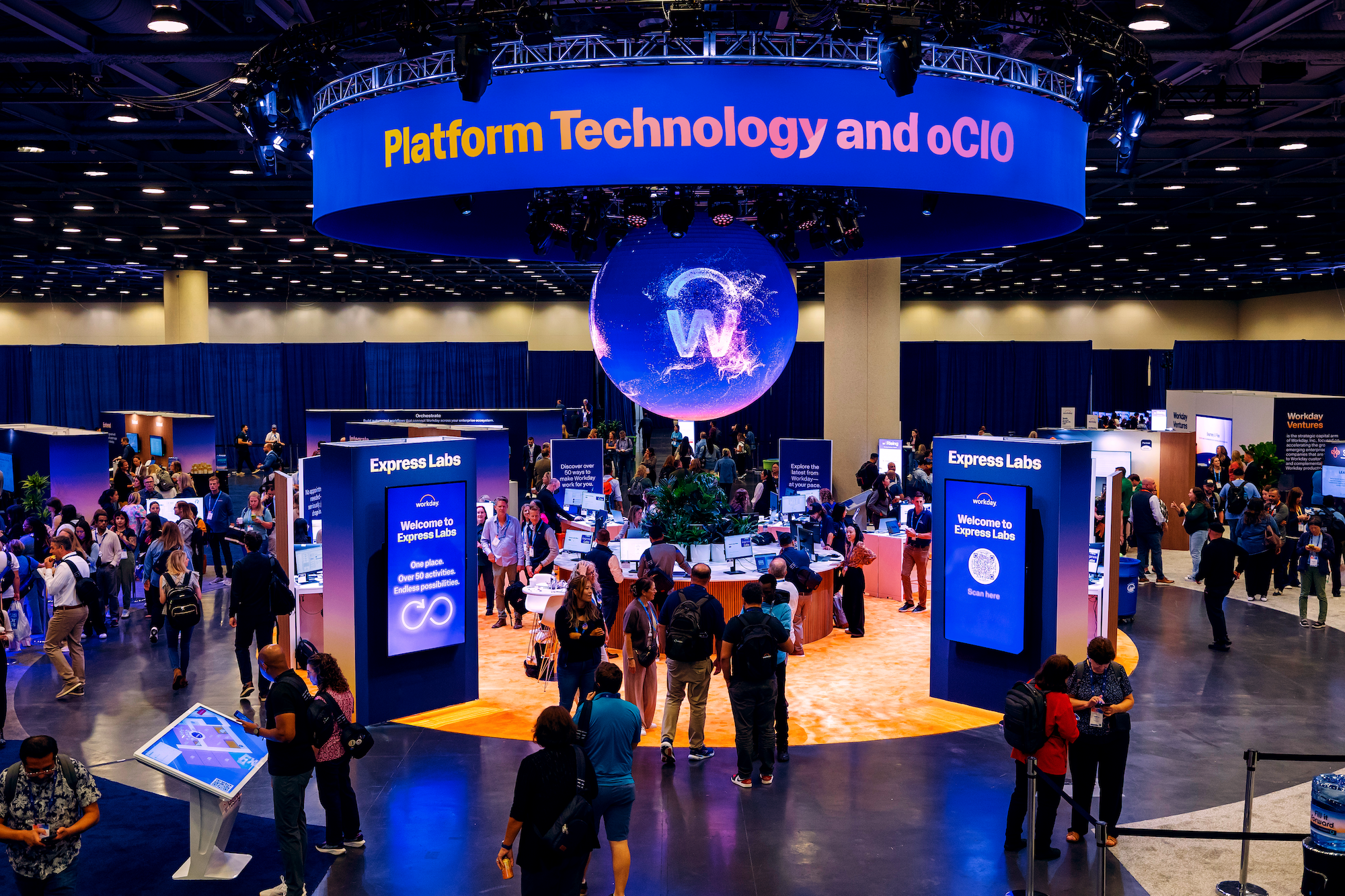
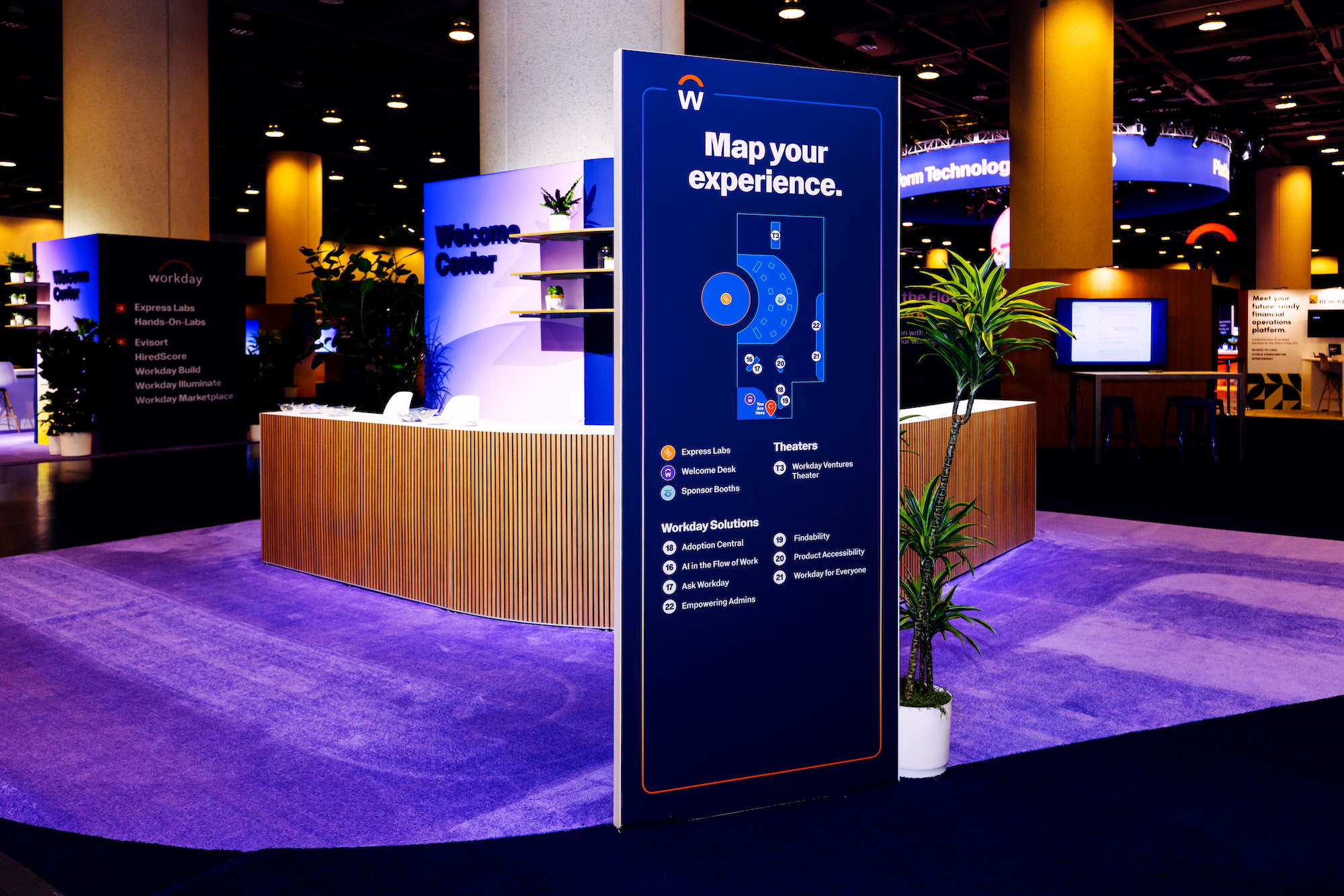
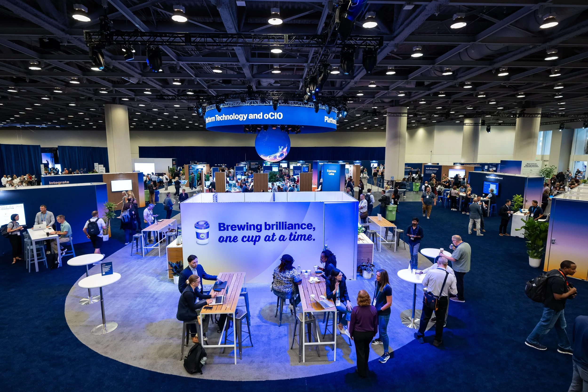
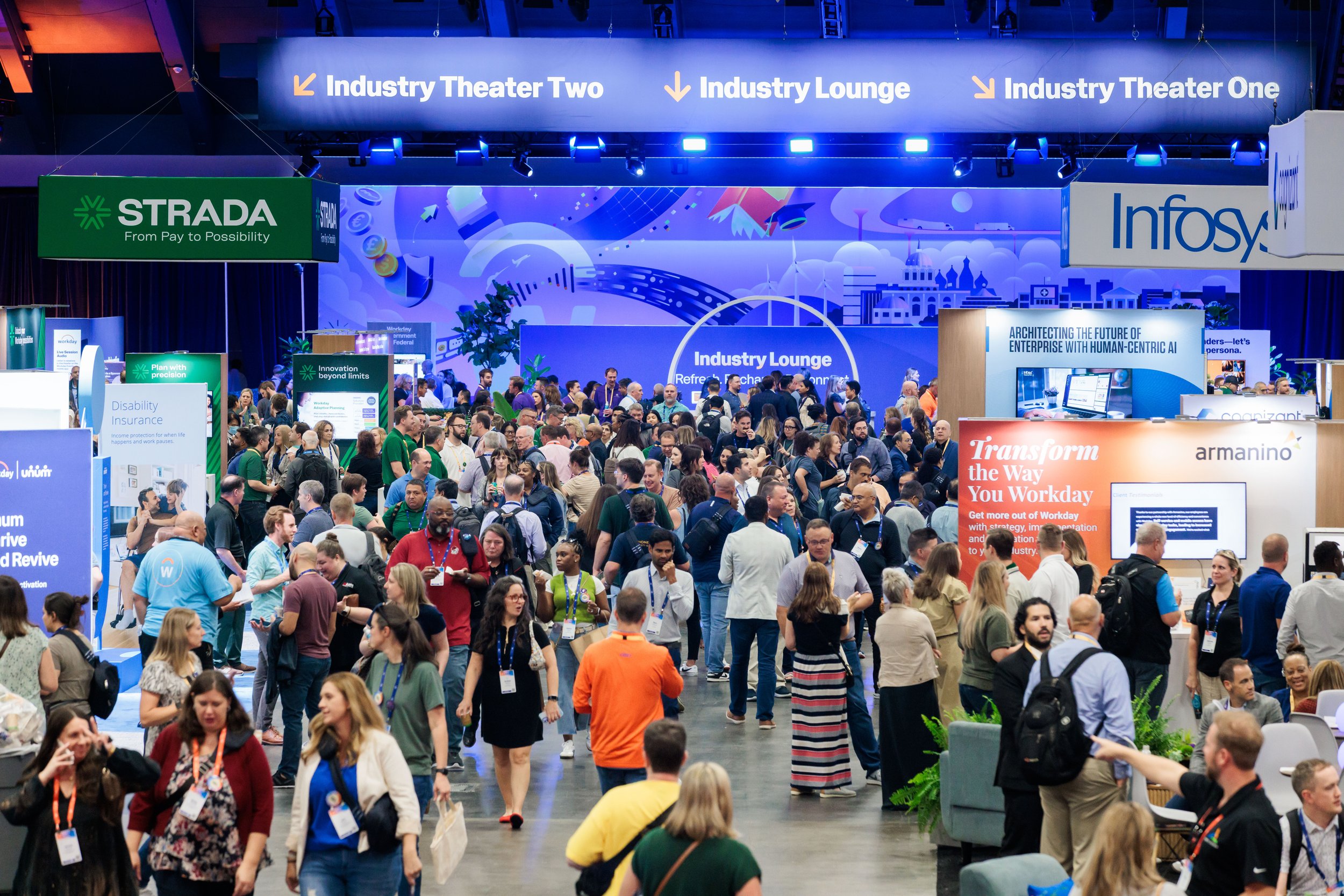
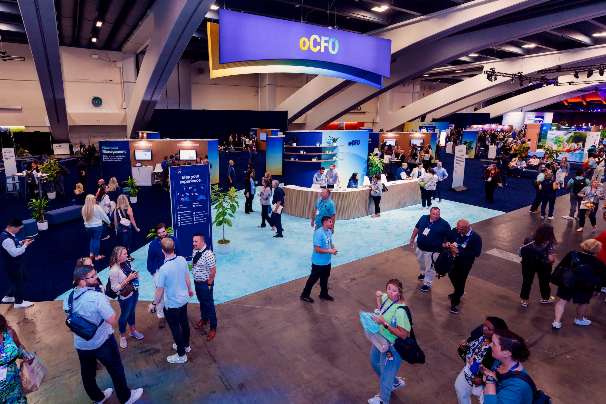
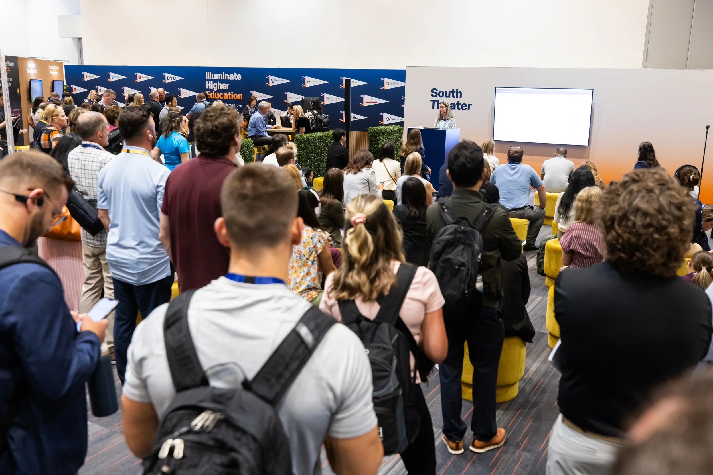
The Expos
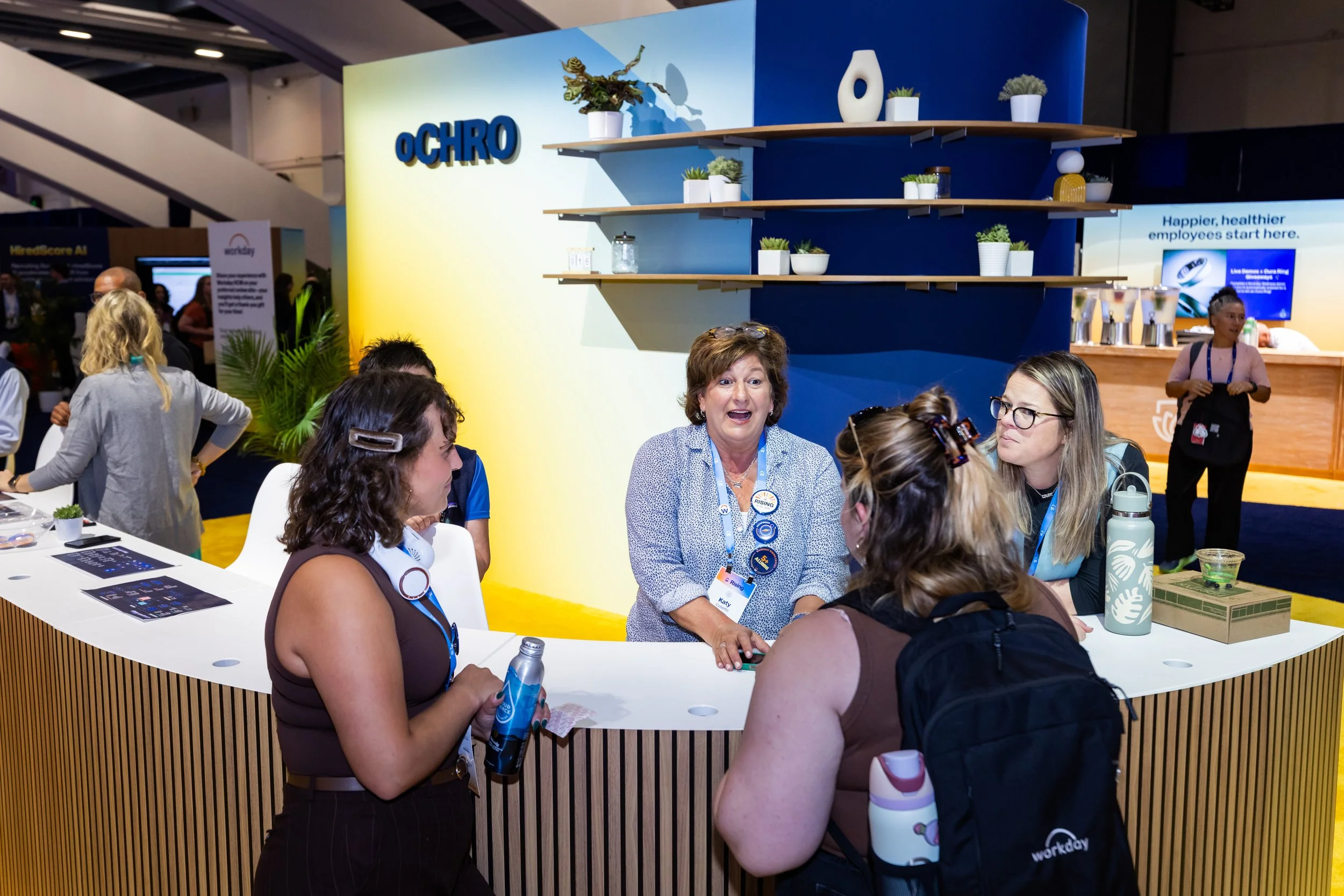
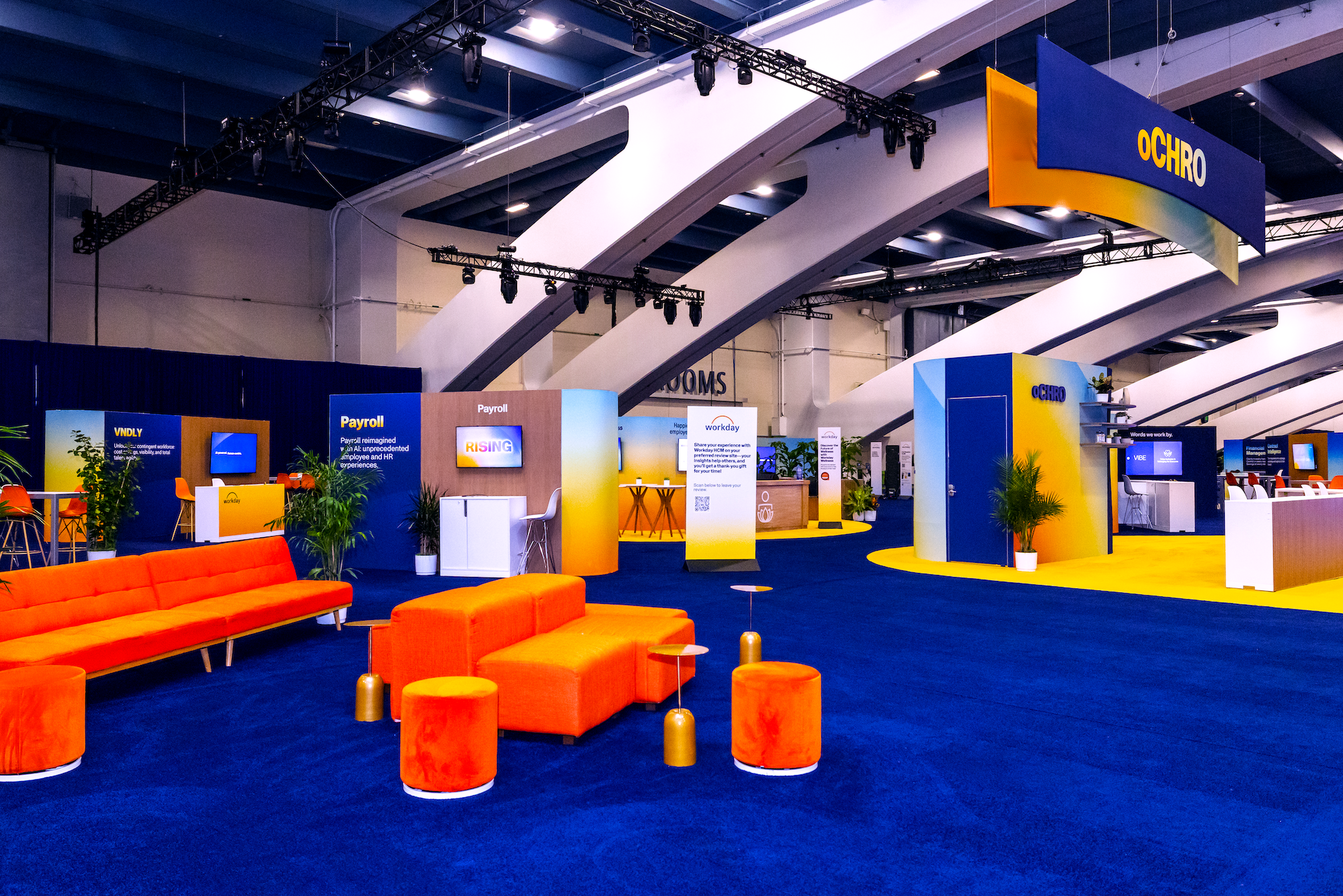
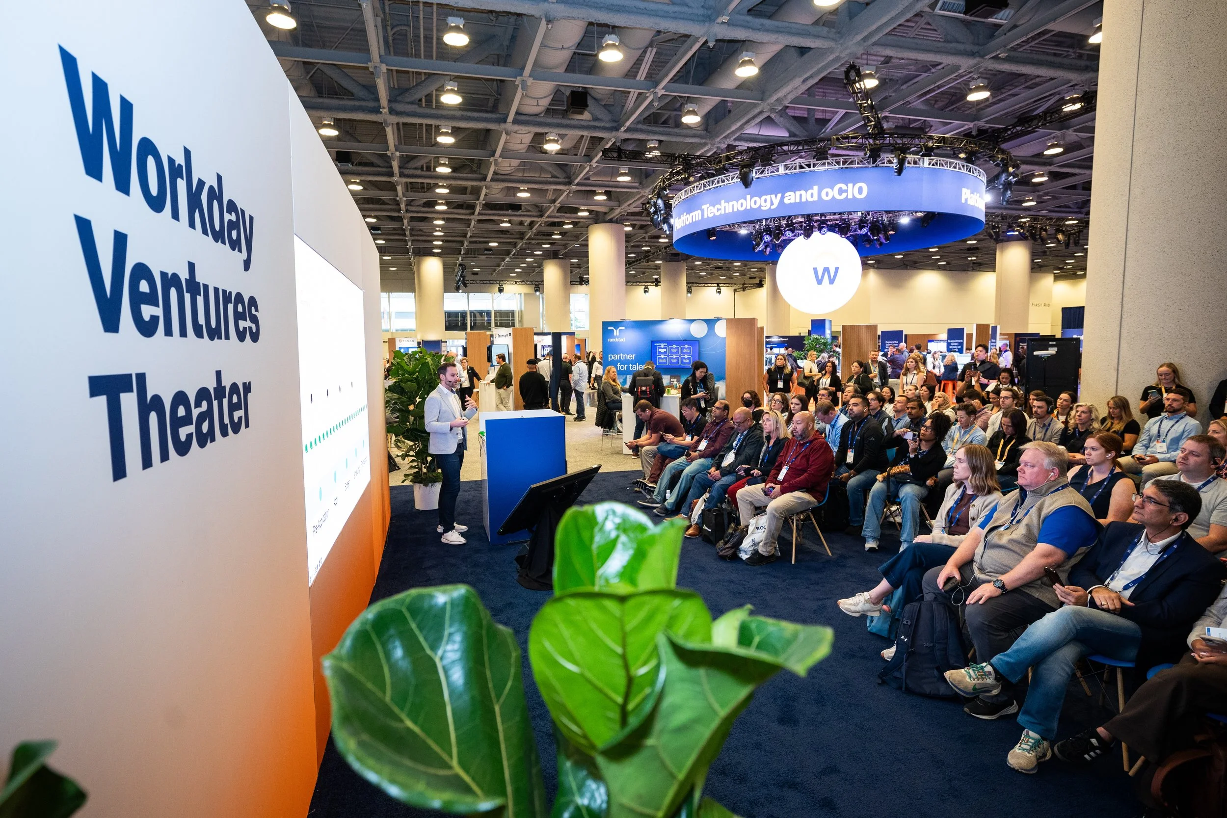
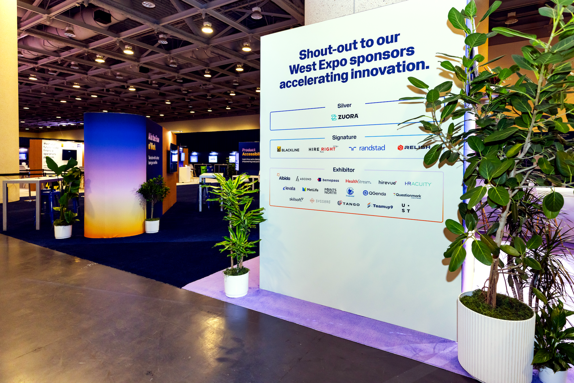
For the fourth year, I partnered with Aly Cunningham to lead the Rising Expo(s). This year, for the first time, we had two expos (South Expo- housing Finance, HR, and Services Workday Zones, Customer Activations, Sponsors, and “The Core,” and West Expo- housing the IT Workday Zone and Sponsors).
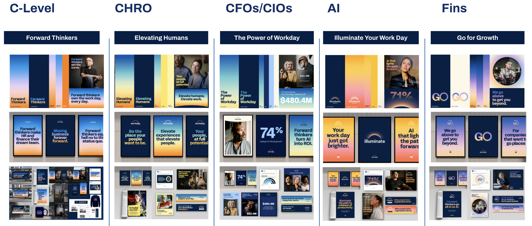
To prevent the massive space from feeling disjointed, we implemented a rigorous color strategy. By mapped each buying center to a specific marketing campaign, we were ensuring that across Workday, our messaging and branding were consistent- and we were using the same creative to hero people in our “Elevating Humans” campaign, as we were using the HR Zone of our Expo at Workday Rising.
“The West Expo was show-stopping in that the developer community typically feels overwhelmed at a place like Rising. I thought the transfer to their own space was perfect. The body language of the people in that room, they were taking their bags off, they were getting comfortable, they were leaning in to have a conversation. You could really see and feel that we knew our audience this year, so from an HR perspective, it was that clean, slick. easy to flow, comfortable, and then for the IT people, it was, like, safe and secure.”
- Senior Director of Product Marketing, Workday
Your vision and execution transformed the West Expo into a masterpiece of how our brand shows up in the world—elevated, inspiring, and unmistakably Workday. Express Labs didn’t just deliver learning; it became a north star for the event, a beacon of inspiration, and even an unplanned photo opp hotspot where attendees couldn’t help but capture the energy you created.
Pushing the Brand
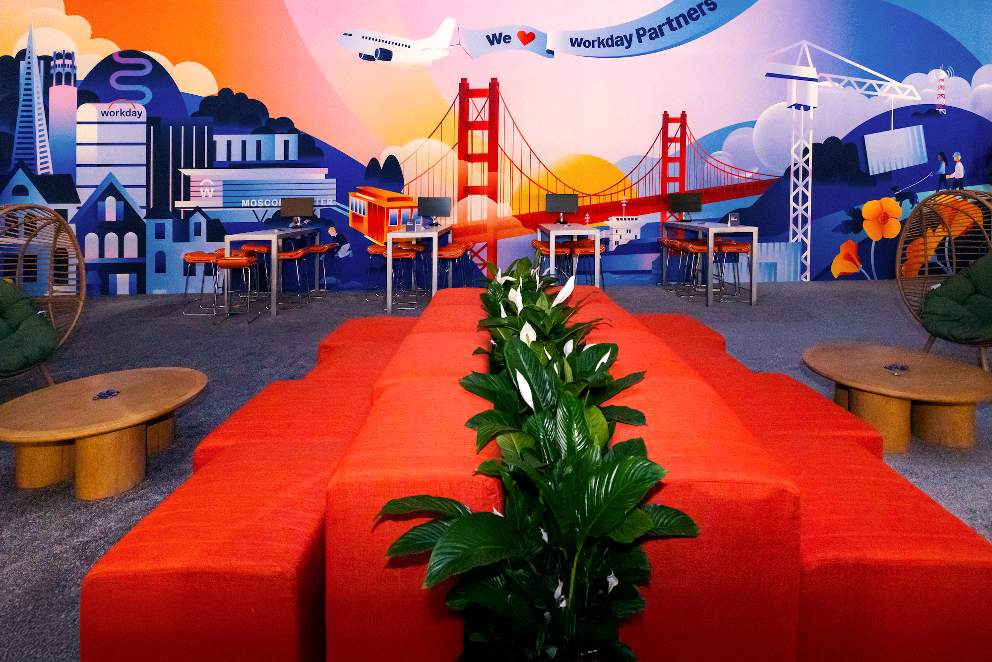
With our brand reliant on emotive gradients, bold text, and hero treatments, we had to find elements and styles to complement that direction in highly narrative moments. This Workday Partners mural, and UX Timeline were two examples of how we pushed the brand for that purpose.
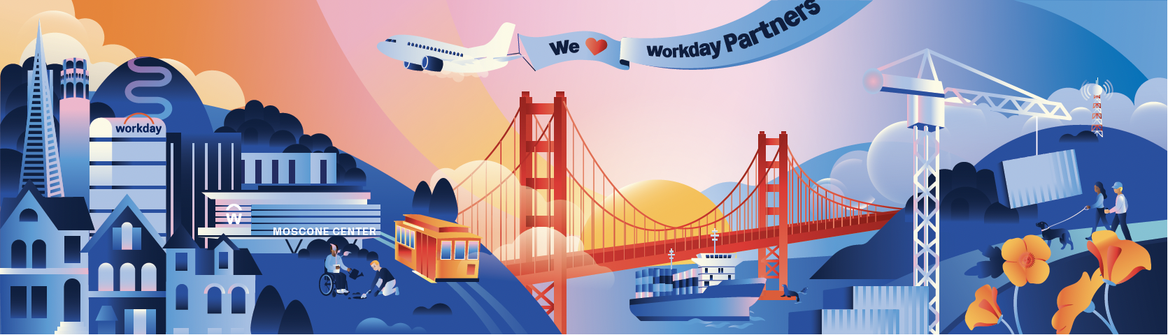
The 56-Foot Partners Mural
Our existing brand illustration style was built for small "spot" graphics. For this mural, I had to expand that language into a full-scale scene. I illustrated the entire 56-foot wall to tell a story of community and connection, using the sunrise motif to ground the narrative in our San Francisco setting. This became one of the first major examples of human-centric storytelling within our new brand system. Not only was this a a highly photographed moment, but this illustration was leveraged throughout the event on a digital sphere in our “Express Labs,” as stickers, patches, and on 5K signage.
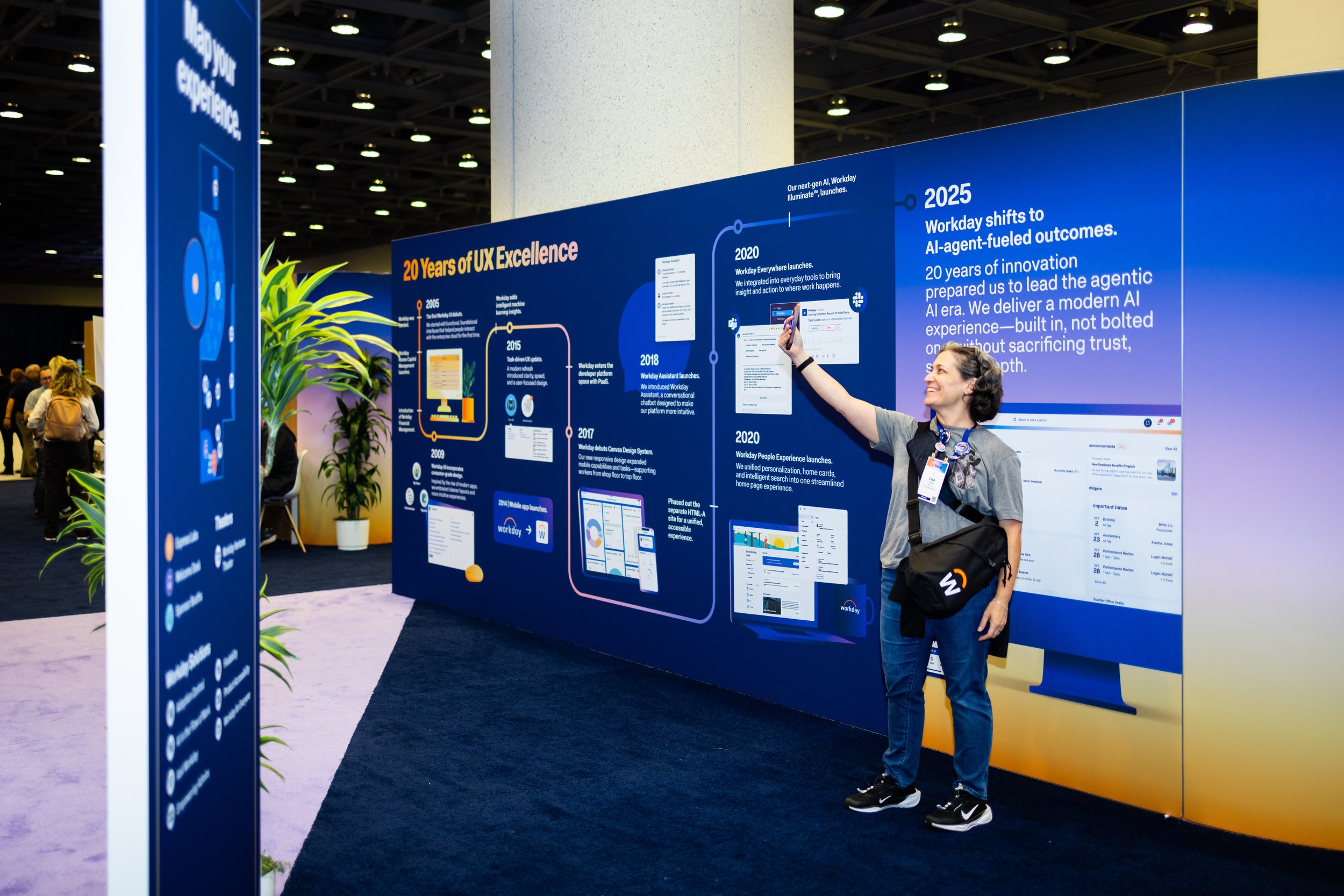
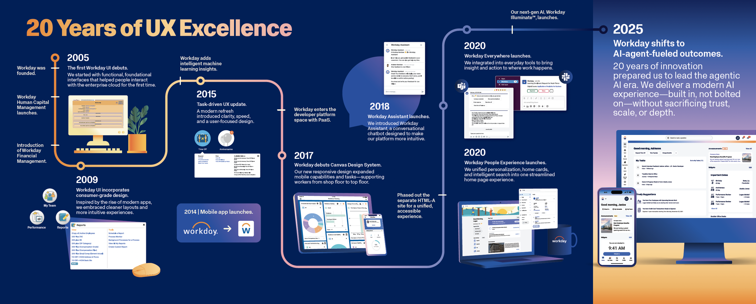
The UX Timeline Challenge
Creating the UX Timeline was a masterclass in technical problem-solving. The task was to take over 30 screenshots—ranging from low-res, 50px legacy images from the early 2000s to present-day interfaces—and tell a cohesive story of innovation.
Beyond the technical hurdle of printing 72 dpi images on a 20-foot wall, the true challenge lay in the information architecture. These were "uncohesive" visuals; many were zoomed-out interfaces with massive amounts of copy and data that would be illegible or overwhelming at scale. We had to act as editors, working closely with stakeholders to identify the "hero" feature of each year.
Once we uncovered the true focus of each screenshot, we worked with our agency, PAIR, to vectorize the UI and pull out the relevant visuals that supported our main message. We designed various devices and "props" using our illustration style and event colors to house these interfaces. This provided the necessary hierarchy to ground the screens, allowing attendees to see not just a software evolution, but a curated history of how Workday has simplified the user experience over twenty years.