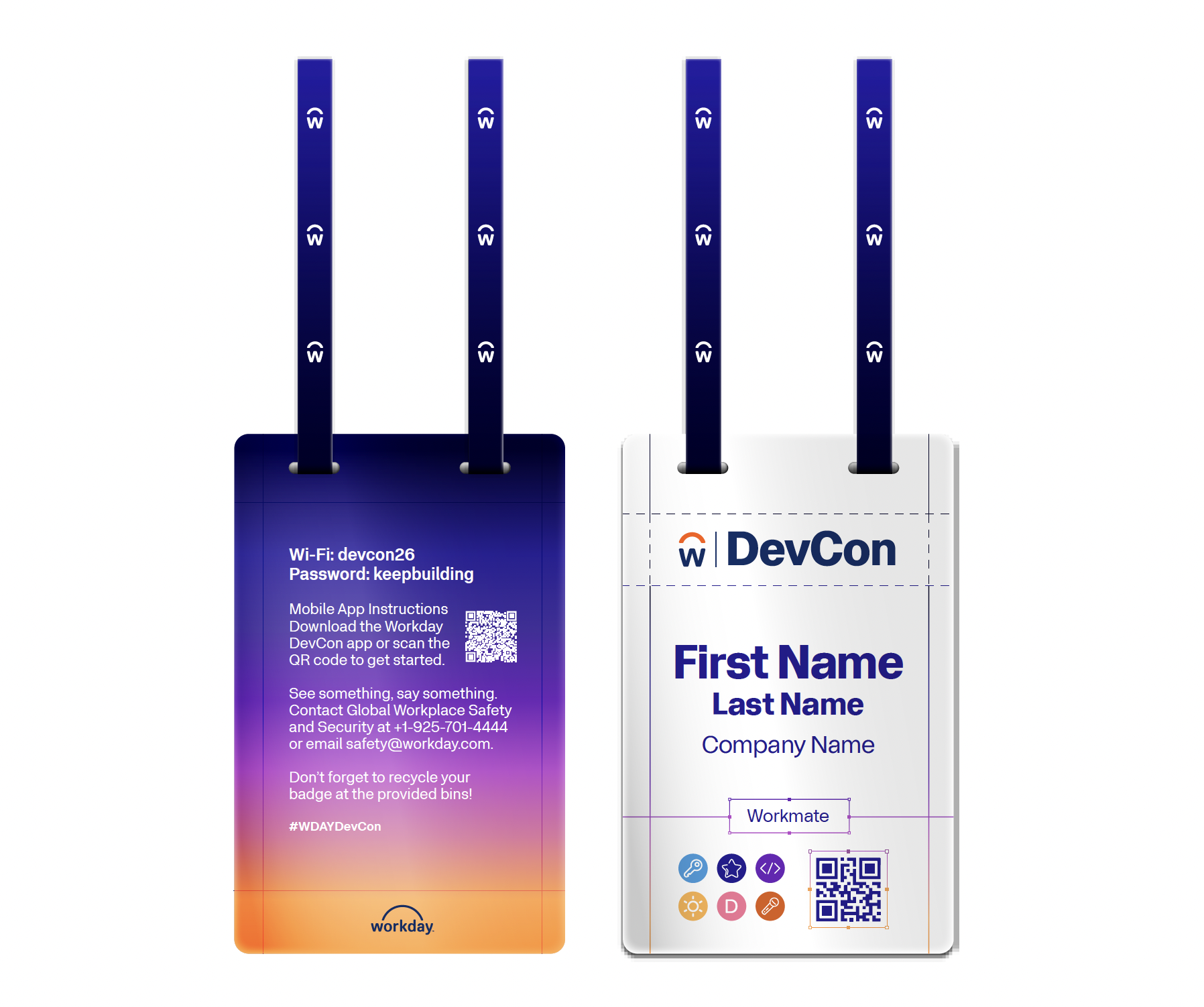
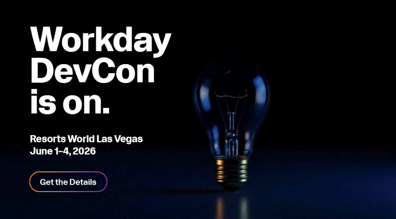
Workday
Developer Brand
Through partnering closely with the Workday Developer Team, attending external developer events (like DevFest and TDX), working on our own developer event, DevCon, and doing lots of research, it was clear to me that developers don’t respond to traditional marketing. In order to win the business of developers, we need to market to developers. This community doesn’t respond to traditional marketing. They want to be shown, not told, participate, not watch. They want to see themselves in the brand, not someone else.
My creative mission was to strategically evolve the visual identity and messaging to create an environment designed with and for this developer audience—ensuring they feel seen, celebrated, and ready to build.
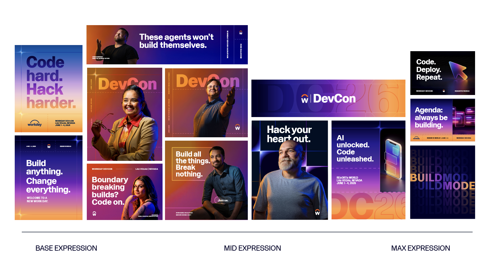
The Spectrum of Expressions
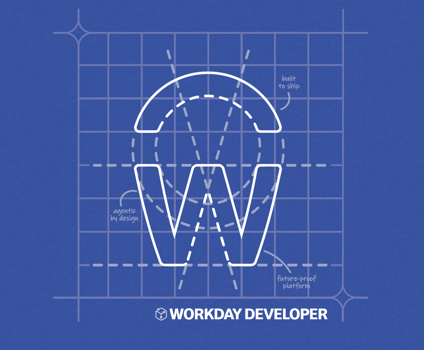
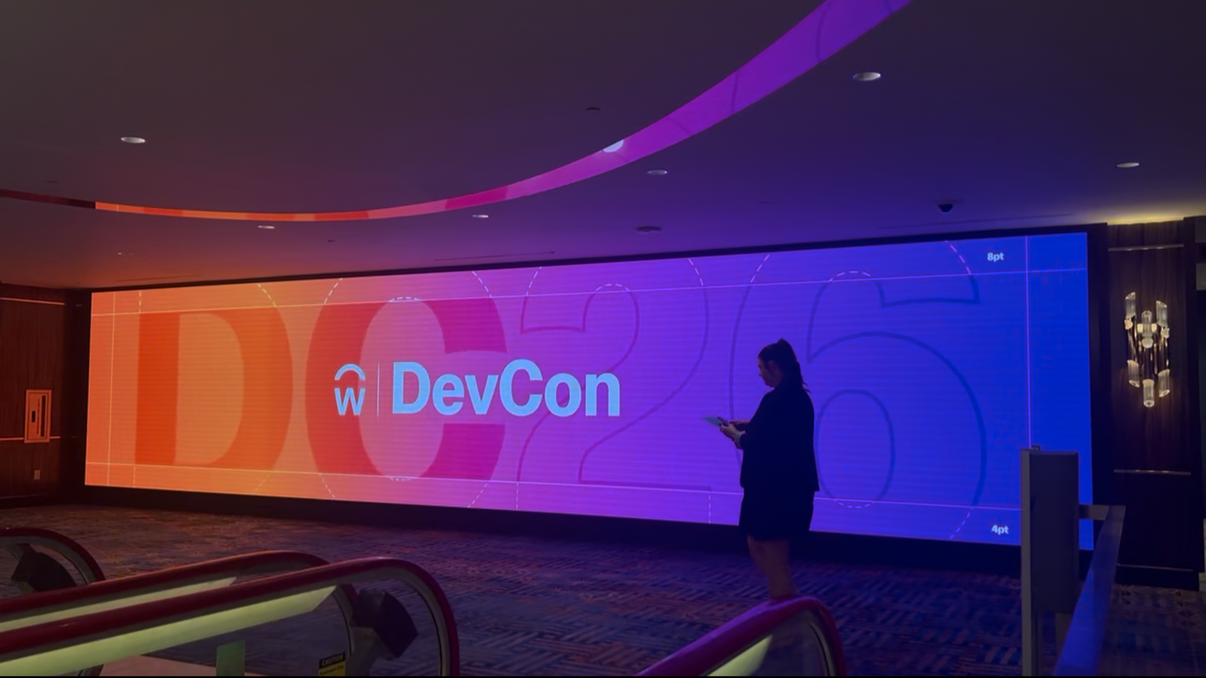
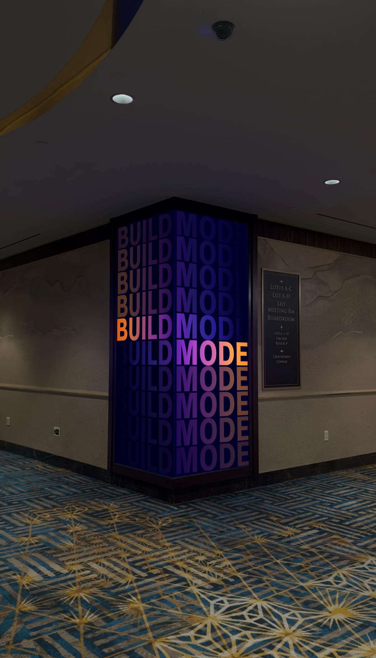
The look and feel is built on the idea of modular systems, celebrating those key points of intersection where the grid lines meet- inspiration, excitement, energy, community, and AI.
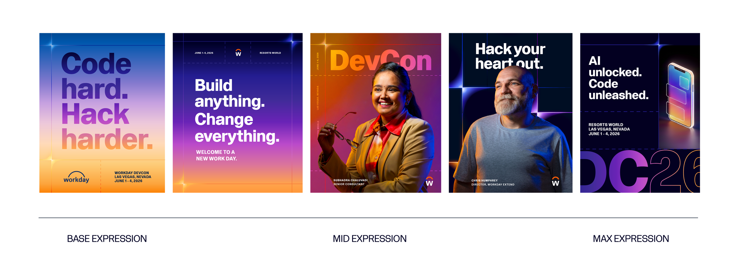
The direction operates on a spectrum, where the playfulness inherent in the act of building is expressed from least expressive to most expressive. From messaging at the forefront, to heroing the people at heart of the community, to playful and highly expressive moments, I’ve created a spectrum of expressions.
And like the act of building, there are layers to it, there’s progression and development, there’s structure and frameworks, and there’s creativity built on top of it. It can be flexed from end to end along with event programming, and community touchpoints across Workday.
I just got all the feels.
This is so in line with where we are today.
Illustrations and Photography
Illustrations
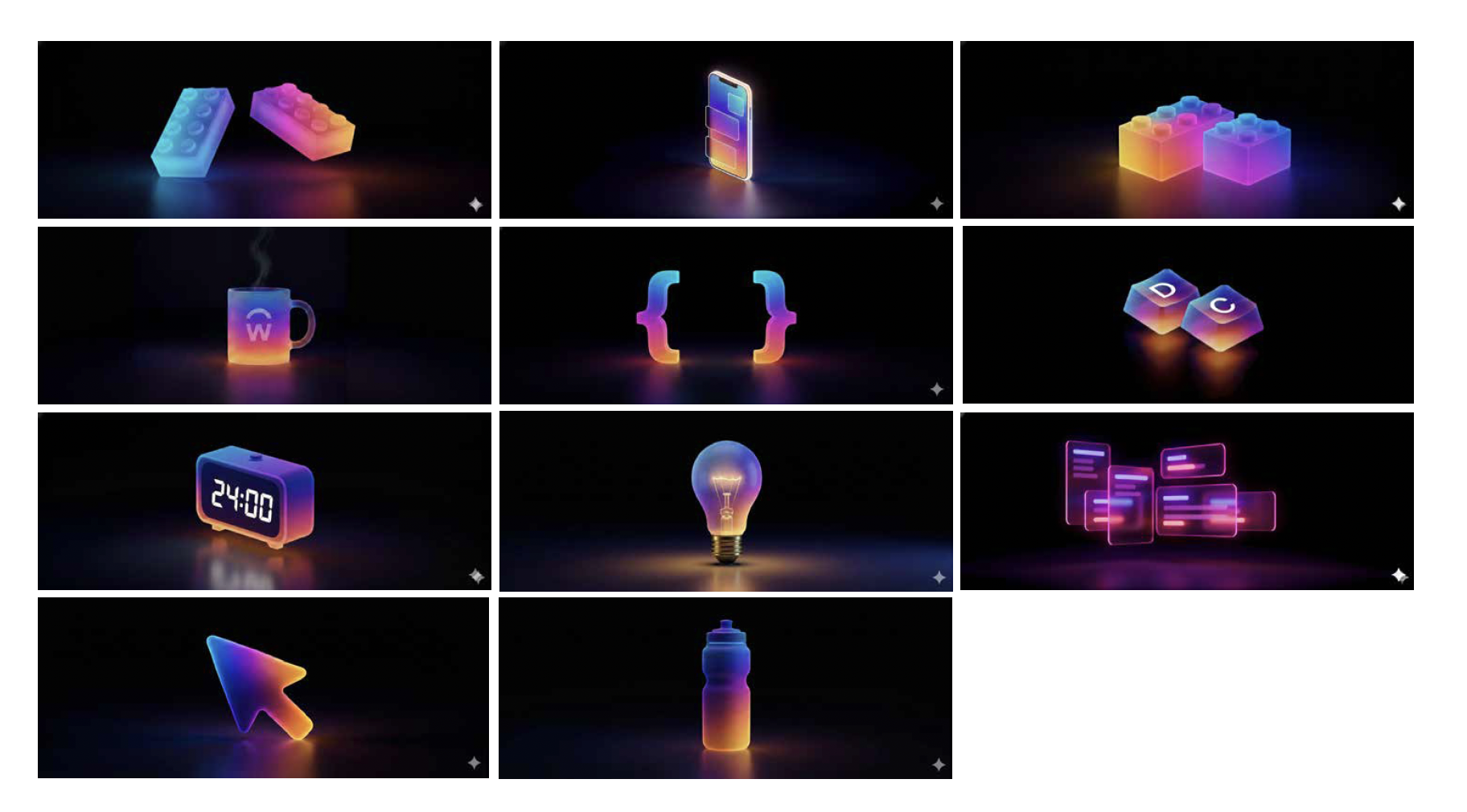
By providing clear art direction and stylistic references, I developed a custom illustration library using Gemini. My goal was to create a style that felt distinct from standard Workday illustrations while remaining part of the same visual ecosystem.
To maintain brand alignment, I stayed true to the established 'spot illustration' format and the perspective of objects. However, I leaned into a new color palette, lighting, and environment to set them apart. Unlike typical illustrations designed for light backgrounds, these were built for 'dark mode.' This environment allowed me to emphasize a vibrant 'glow' effect and strong light reflections—creating a library tailored specifically to the world of the developers they were designed for.
Photography
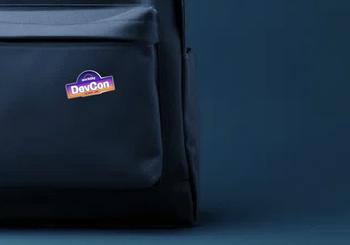
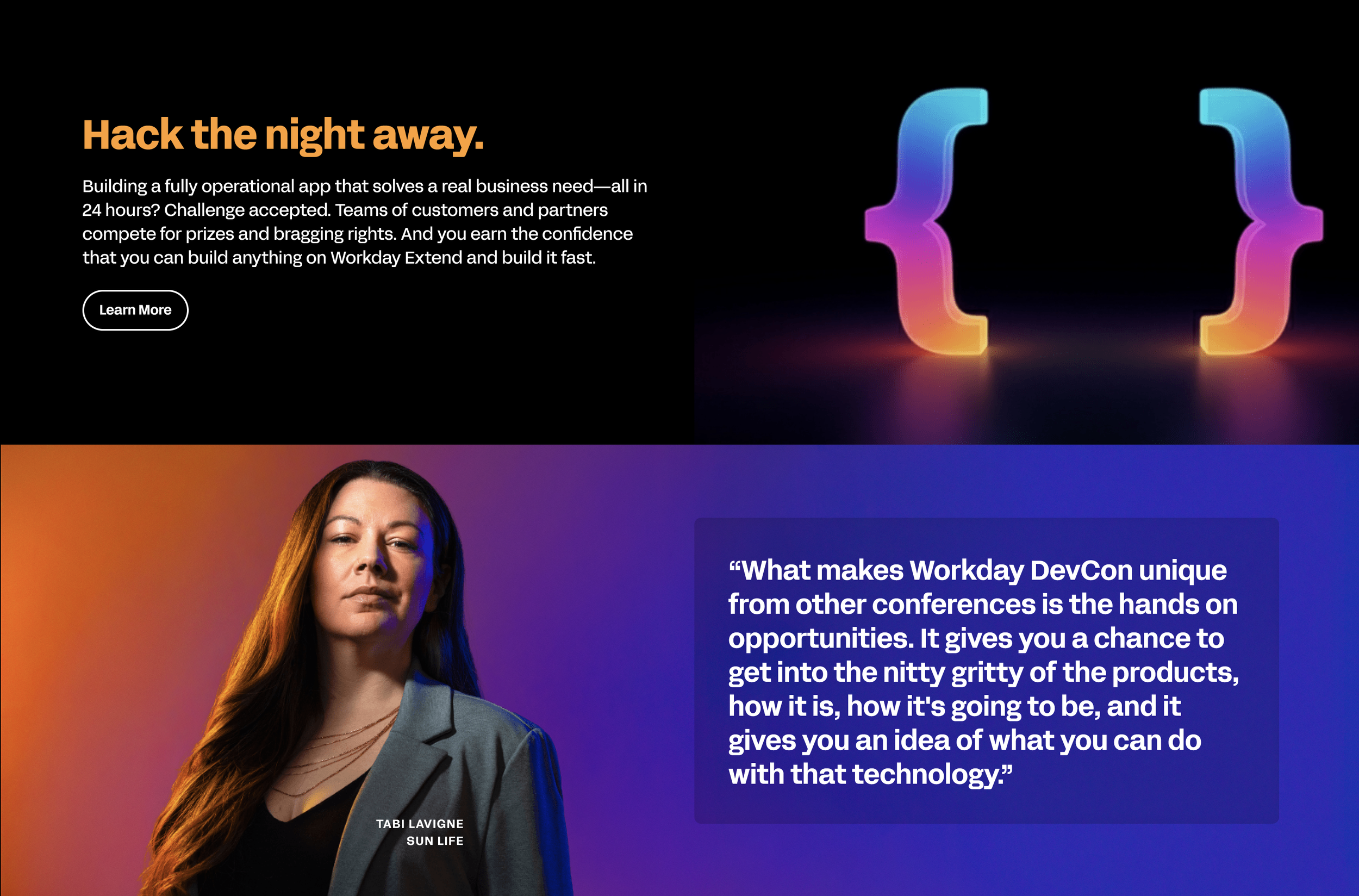
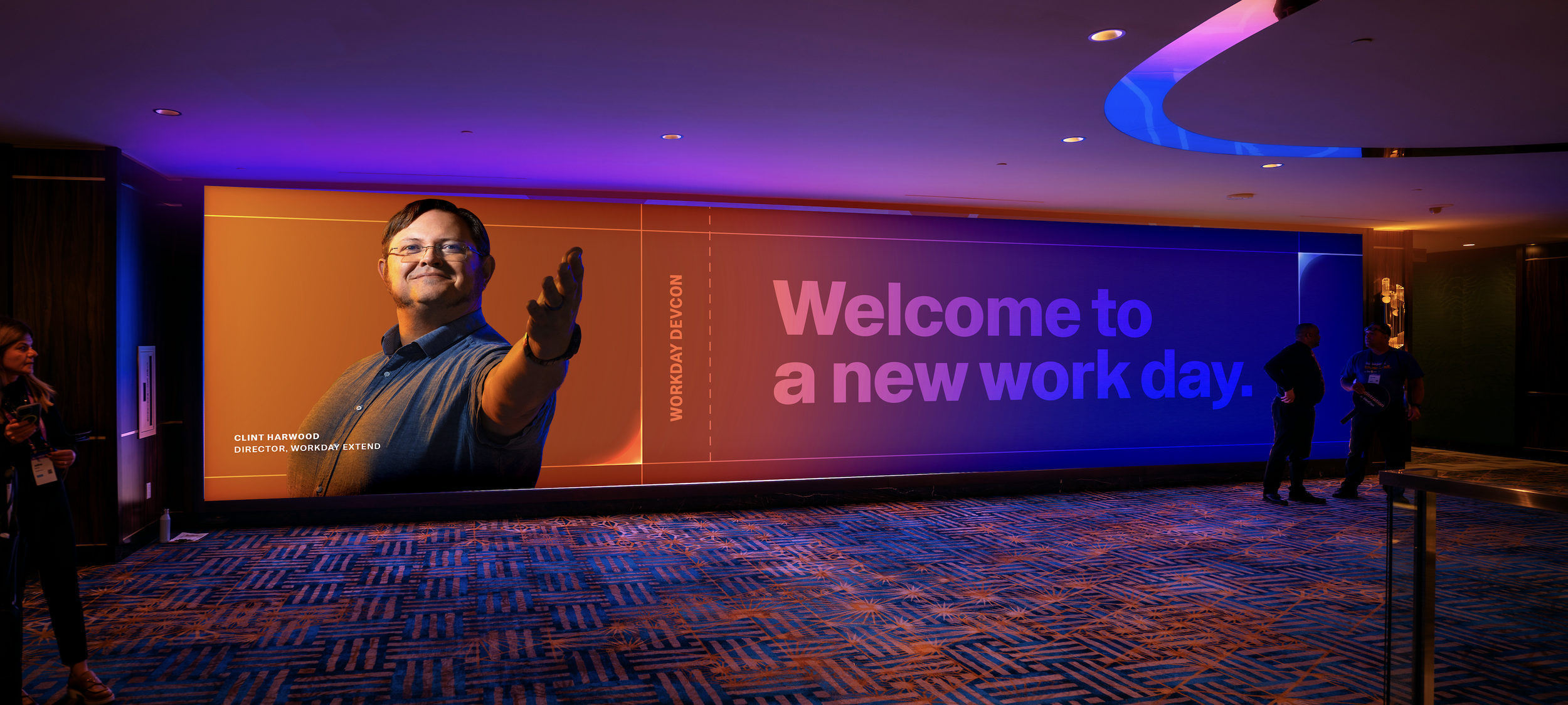
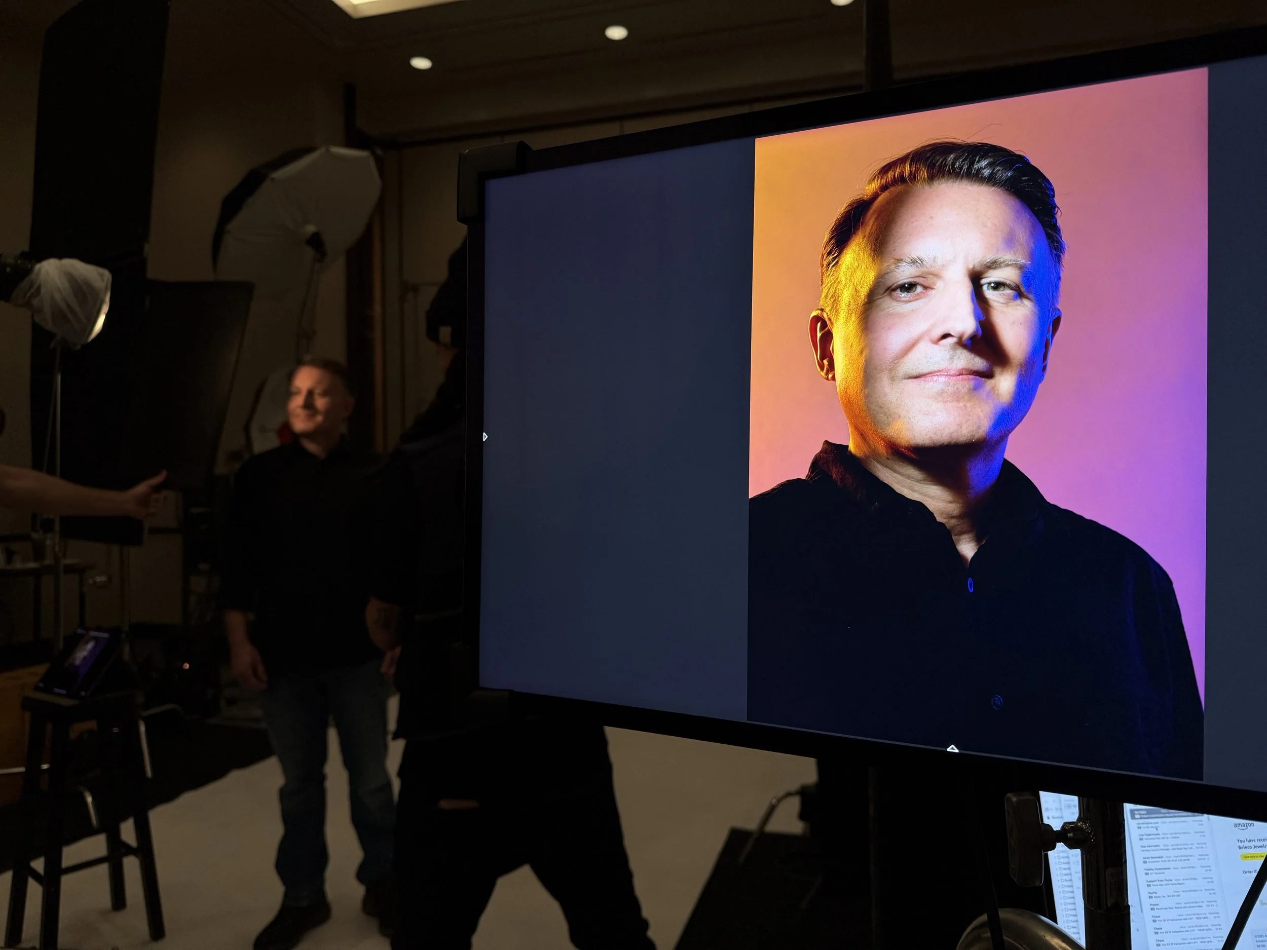
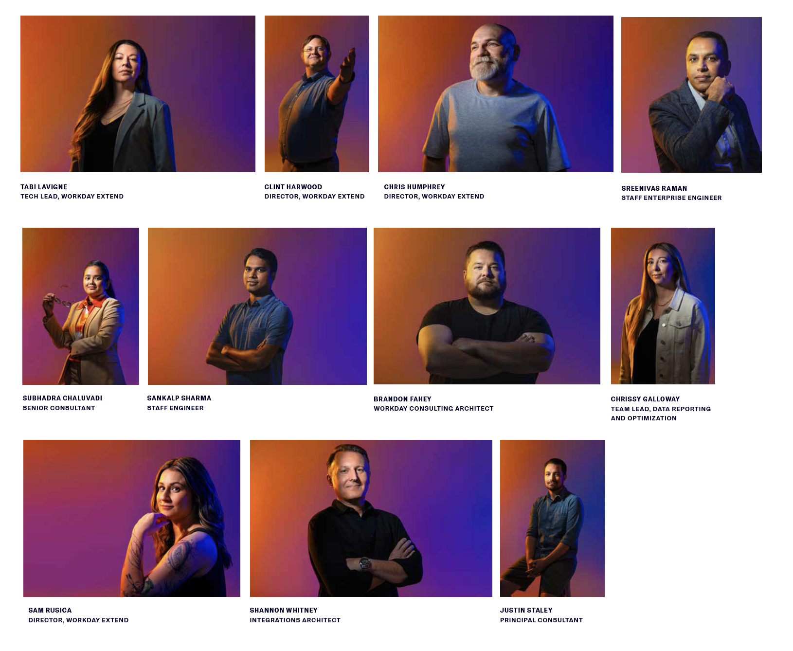
I set out to build a brand where developers could truly see themselves. Using photography from our 2025 DevCon photoshoot, we made that a literal reality. My goal was to communicate that the Workday brand wouldn’t exist without its contributors. I wanted developers to see their own faces on our website, social media, keynotes, and event signage, fostering a sense of pride in being part of this community—and inspiring other attendees to wonder, 'How do I become one of them?'
Though the photoshoot preceded the new brand identity, it became a foundational influence on its direction. The intensity of the light sources, the warm palette, and the bold, inspired stances of the subjects shaped our visual language. We intentionally chose to keep the portraits within their original captured backgrounds rather than silhouetting them against new gradients. This decision added a layer of human dimension and environmental texture that perfectly complemented the broader brand system.
Thank you so much for your creative expertise in our Developer community. Way to help push on the brand, keep it fresh and most of all producing some amazing inspiring creative!!