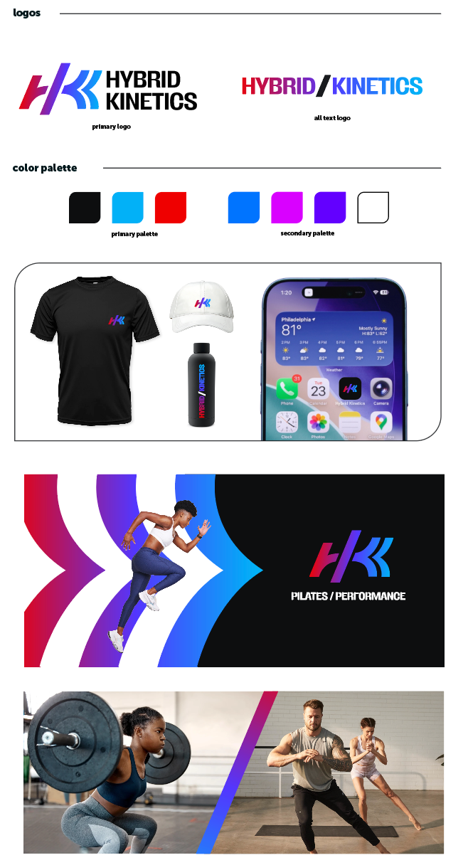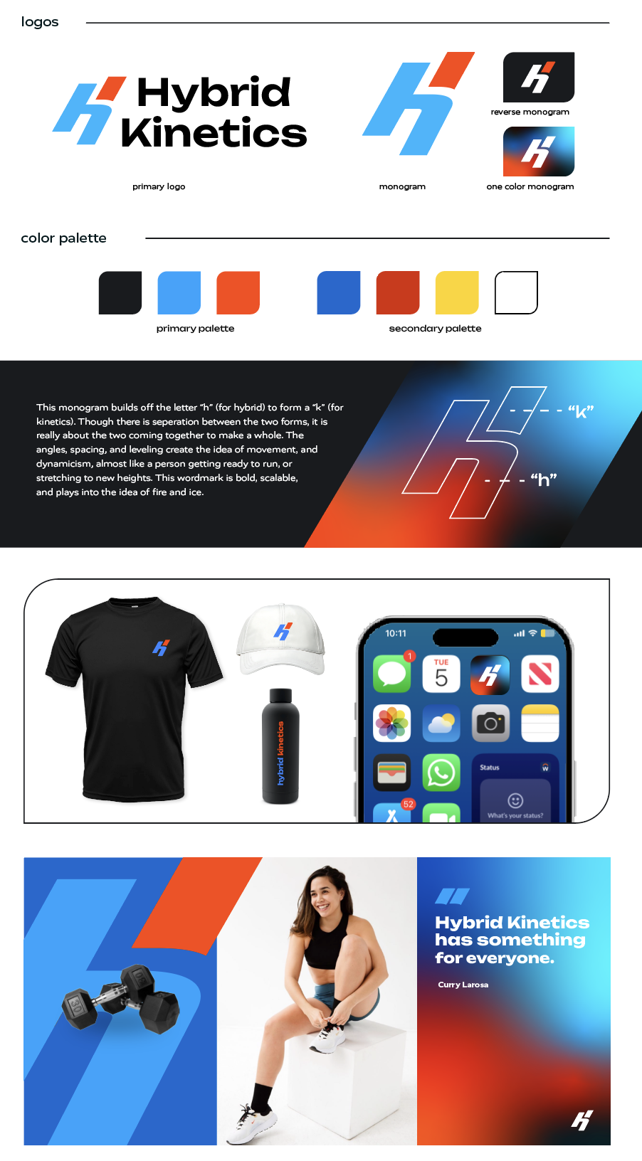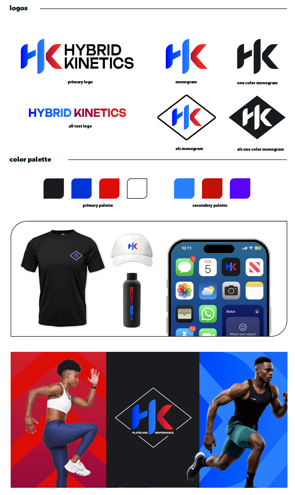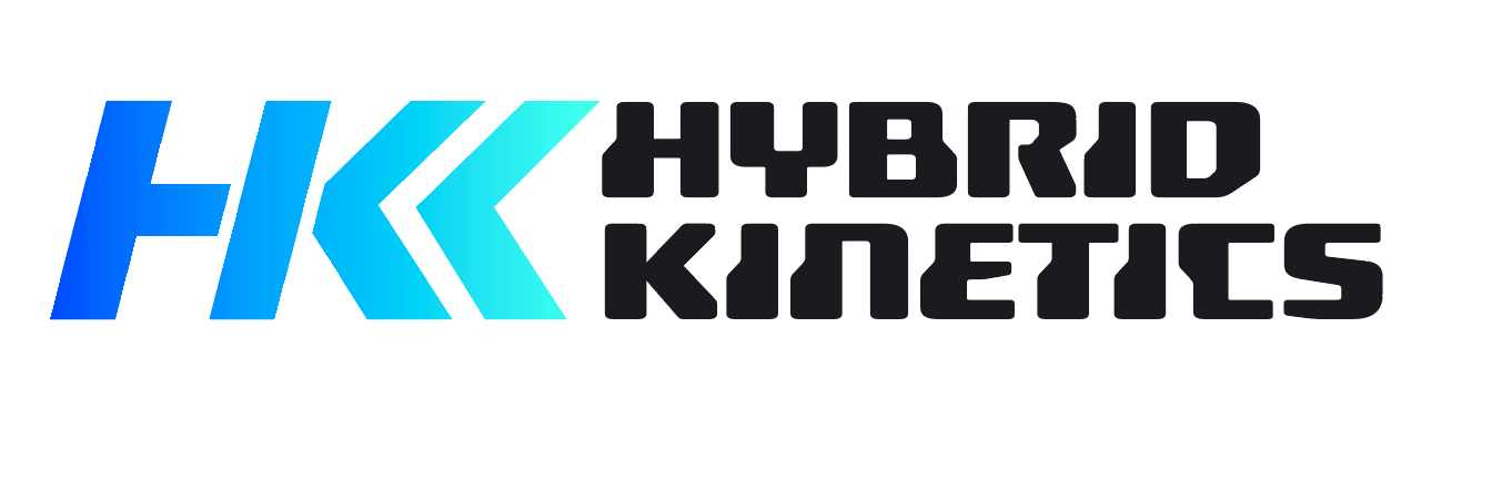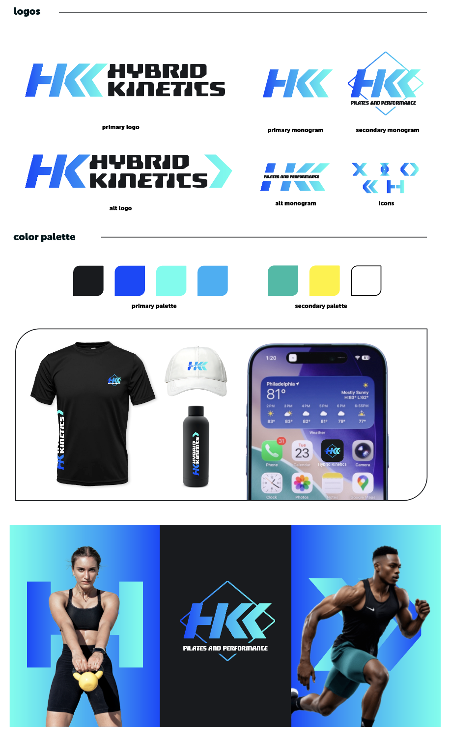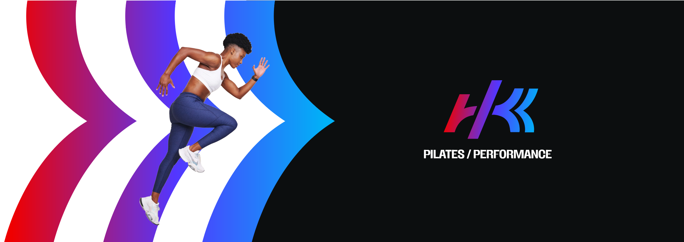
Hybrid Kinetics Brand
Hybrid Kinetics is a fitness app split between “Pilates” and “Performance.” Because the focus of the app was to prioritize both types of fitness, I wanted a brand that reflected just that. A logo that had two halves- divided, yet united. Colors that reflected the spectrum between the two halves. Elements that could be pulled out to reflect movement.
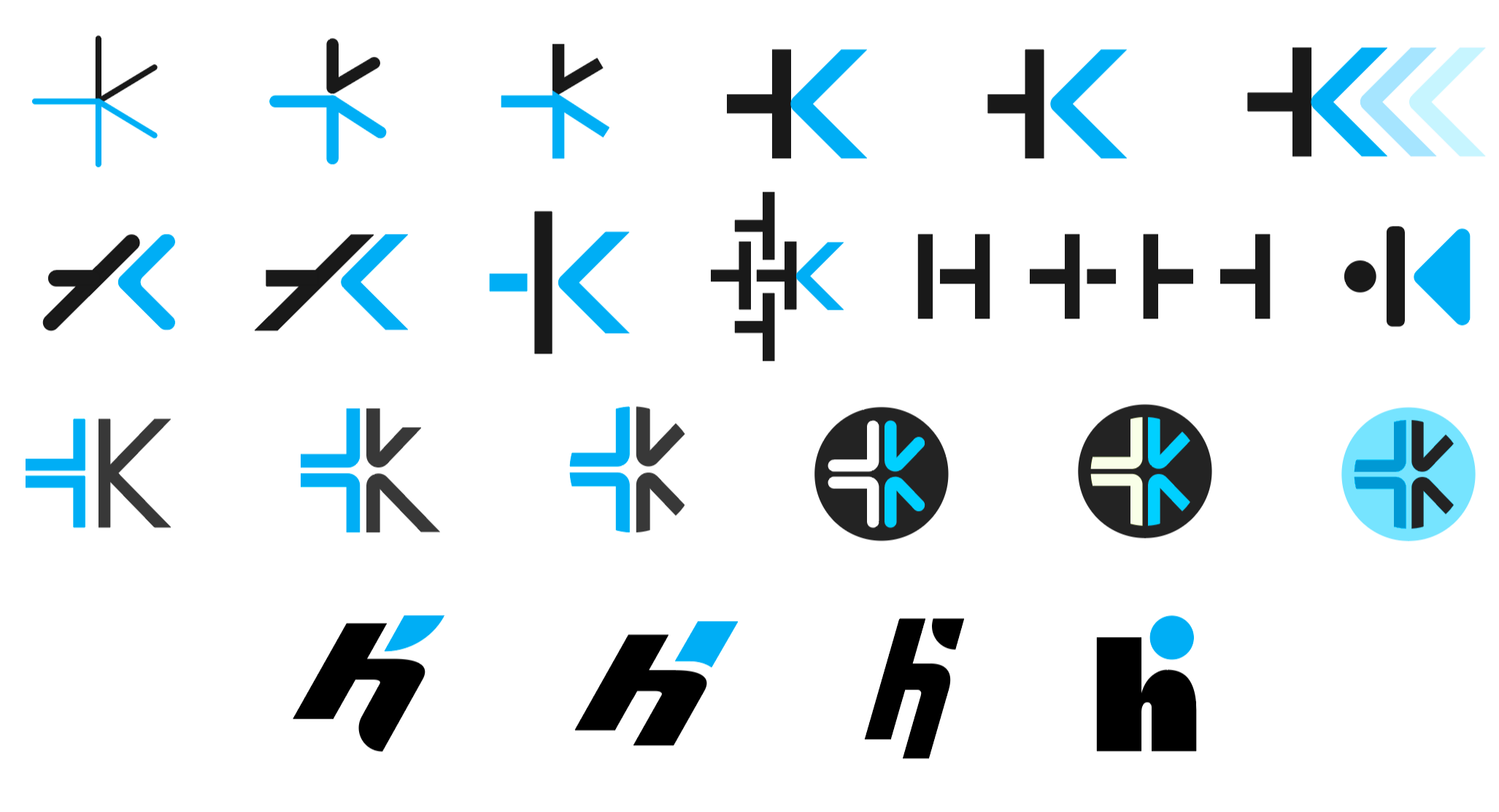
Wordmark Exploration
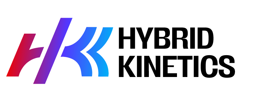
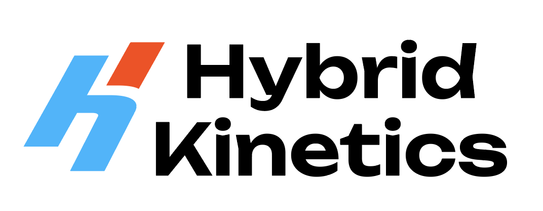
Since the primary touchpoint for the brand is a mobile app, I prioritized developing a high-impact monogram. I explored the intersection of the ‘H’ (Hybrid) and ‘K’ (Kinetics), seeking ways to overlap their forms to create a singular, cohesive mark.
The brand represents a duality: the ‘Pilates’ side focuses on form, strength, and fluidity, while the ‘Performance’ side embodies intensity and energy. To reflect this, I blended soft and hard geometric forms within the logo. For the identity, I reimagined the traditional ‘fire and ice’ palette; rather than treating them as opposing polarities, I created a seamless color transition to represent the full spectrum of the user experience.